Over the years I've made comics, album covers, concept art, and have had my work in galleries. Here is a selection of my professional work, plus some of my favorite art "for fun"...
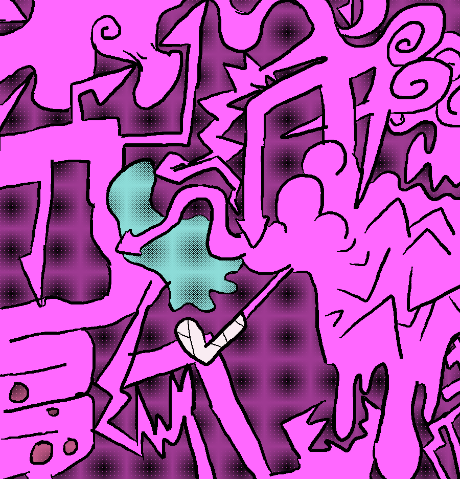
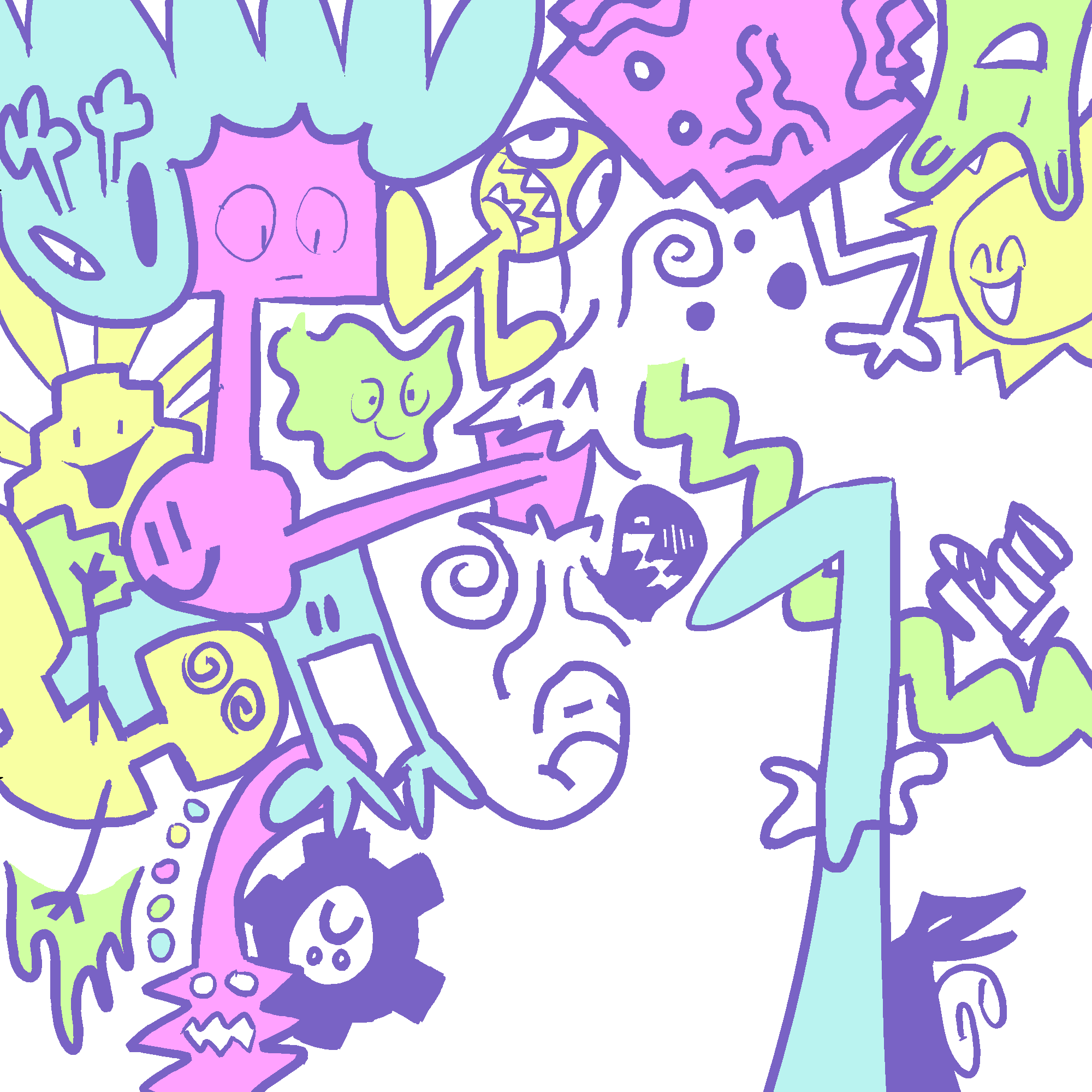
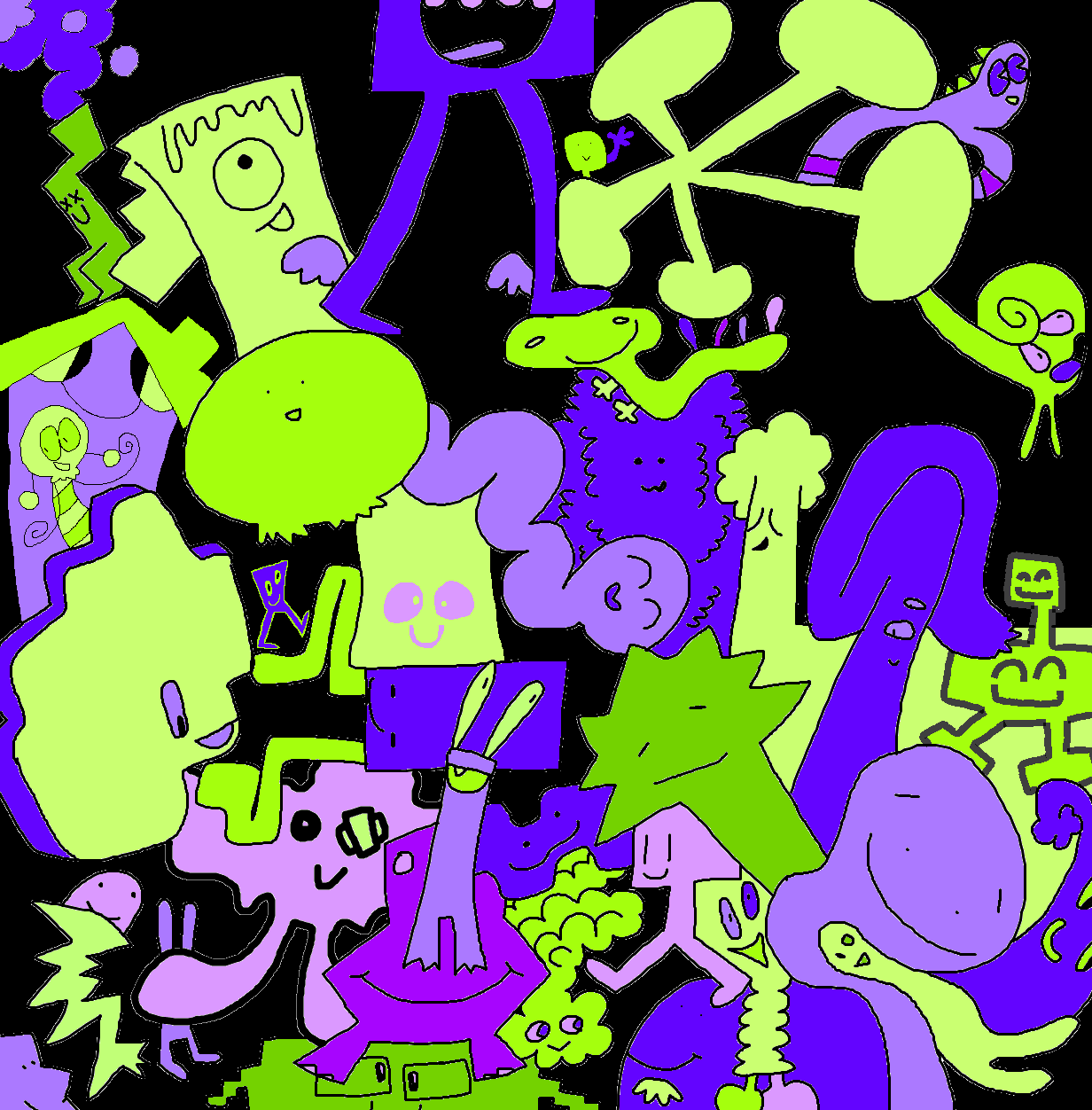
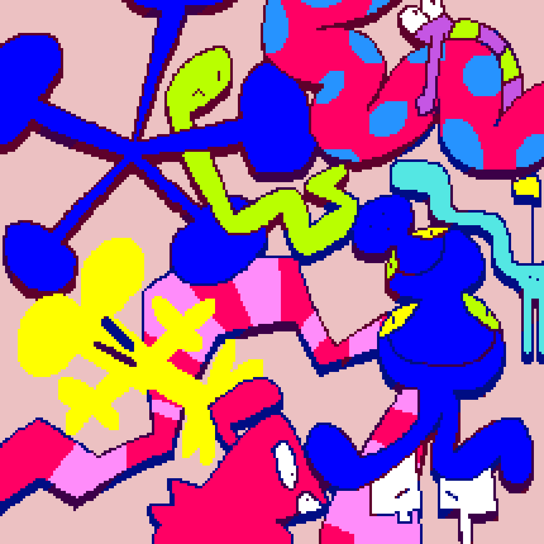
2021-Present: Selected digital illustrations from an ongoing series of works based around a similar format. With these artworks I juxtapose simplistic yet bold characters and shapes in crowded compositions with very rudimentary depth. I draw most in MS Paint, and like to experiment with that software's quirks and hidden features. I'd love to put together a solo exhibition of these pieces someday; here's a handful of them for now!
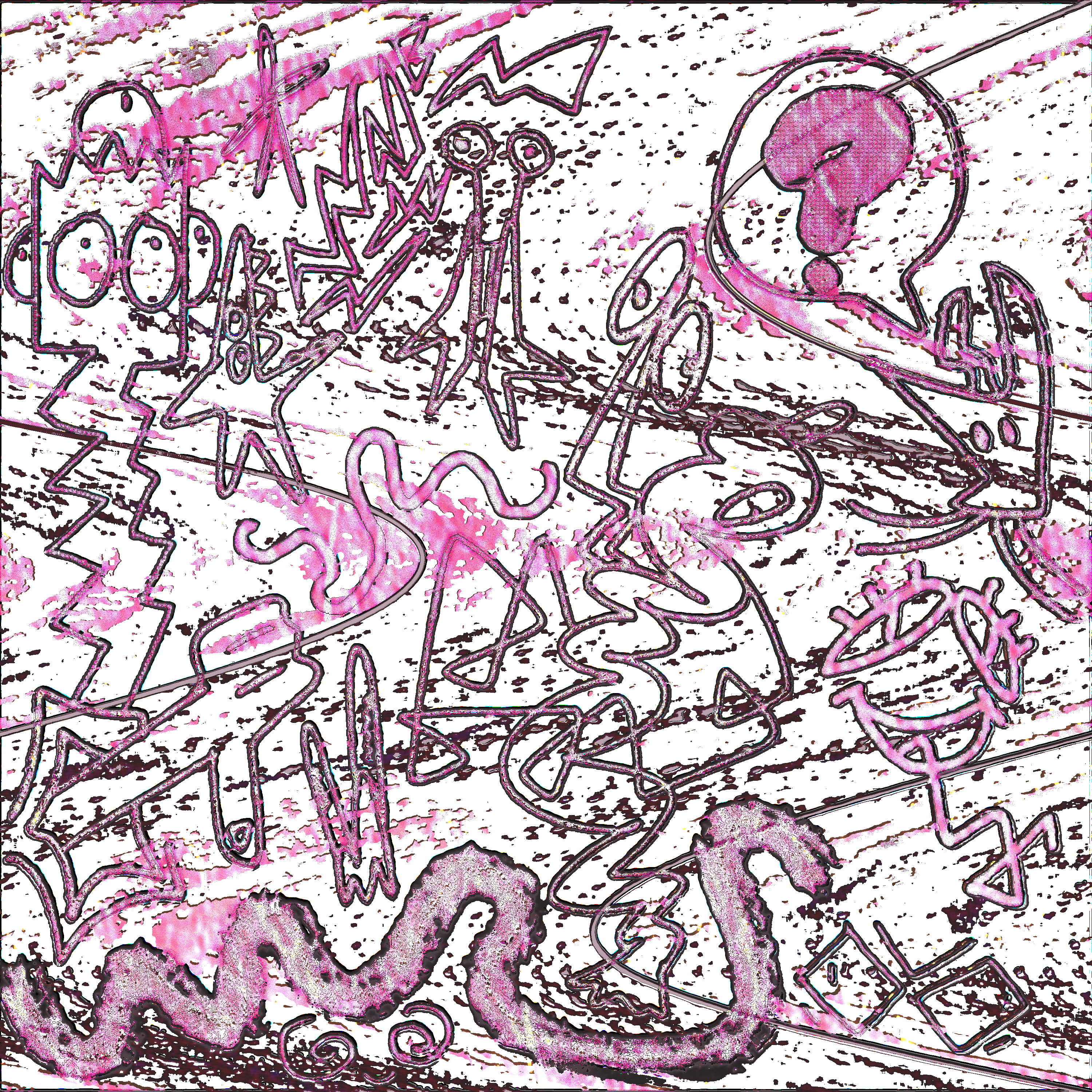
2023: Cover art in collaboration with woegarden 🔗 for its music EP "why rate anything?" 🔗⚠️, released on my label fakenumberland. I drew an illustration/design for the cover inspired by the release's music and themeing in Adobe Photoshop. woegarden added textures and colors to the illustration, and designed a background too!
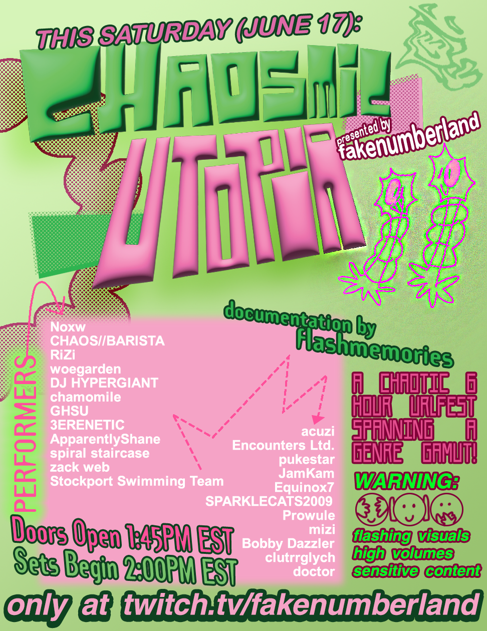
2023: Organization and branding for CHAOSMIC UTOPIA, a digital music event ran on fakenumberland's twitch channel 🔗. I booked and scheduled acts, created the logo and brand identity, promoted the event, and operated the livestream the day of the event; basically, I handled most everything beyond the sets. The promotional poster is pictured below; The awesome SPARKLECATS2009 🔗 helped a little, including making a first pass of the poster (sadly lost to technical difficulties). Special thanks to it! You can watch the event mostly as it happened via flashmemories' VOD 🔗⚠️! (CONTENT WARNINGS: flashing, loud volumes, sensitive themes.)
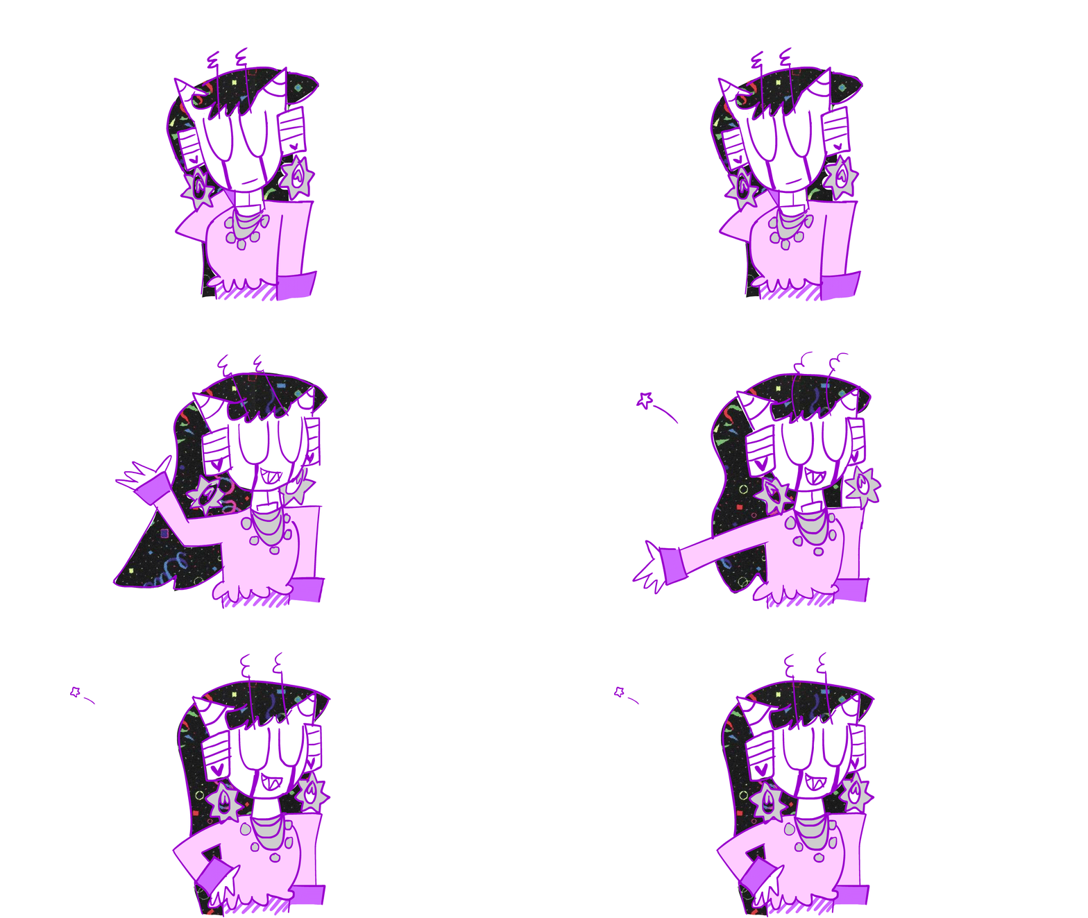
2023: Short frame-by-frame animation made in Adobe Animate, starring my character Vexie flaunting her looks. I drew five unique frames using the brush and fill tools, added a picture of a decorative carpet and erased part of it each frame to fill her hair and match its movement, and timed the length of each frame. Special thanks to GenesisJam 🔗 for suggesting the little star detail!
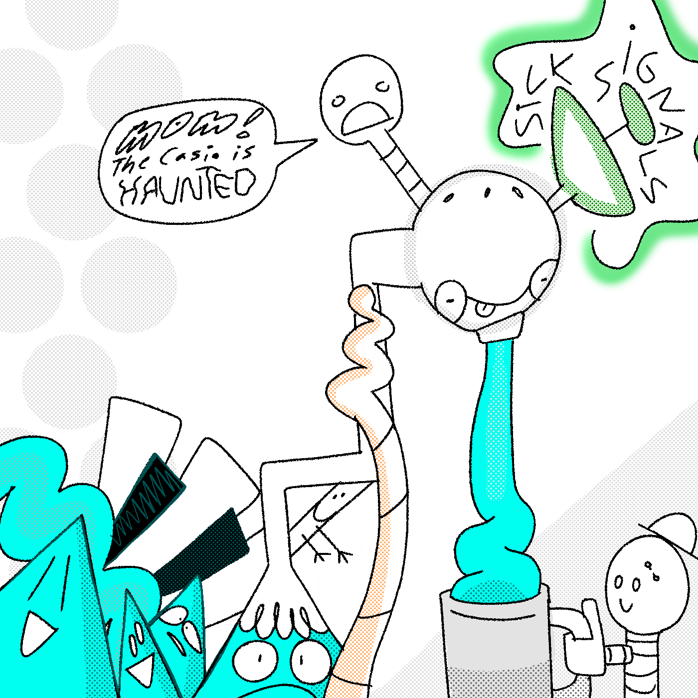
2023: Digital illustration for "SICK! Signals" 🔗⚠️, a music EP by MOM! The Casio Is Haunted, AKA Lovely Abyss 🔗⚠️, for their One And Done project (an entire album or EP every day of 2023!). It's a very high-volume circuit-bent keyboard and radio jam that I got a bit of 50's futurist vibes from! With that in mind, I gave a shot mixing in an early 'Tommorowland' sort of design sensibility with my zany cartoons. It was fun to represent such a chaotic and noisy album with a comparitavely clean style.
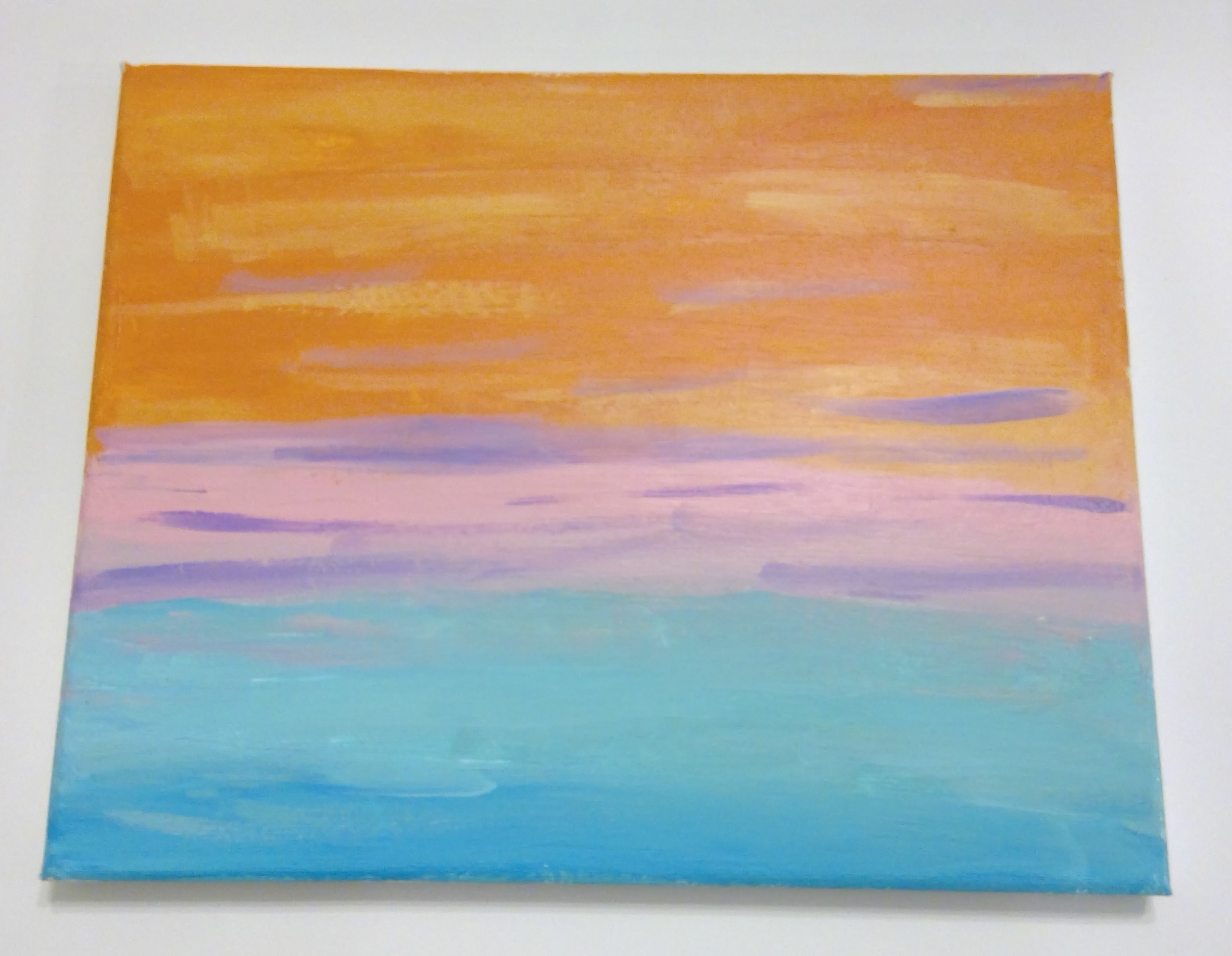
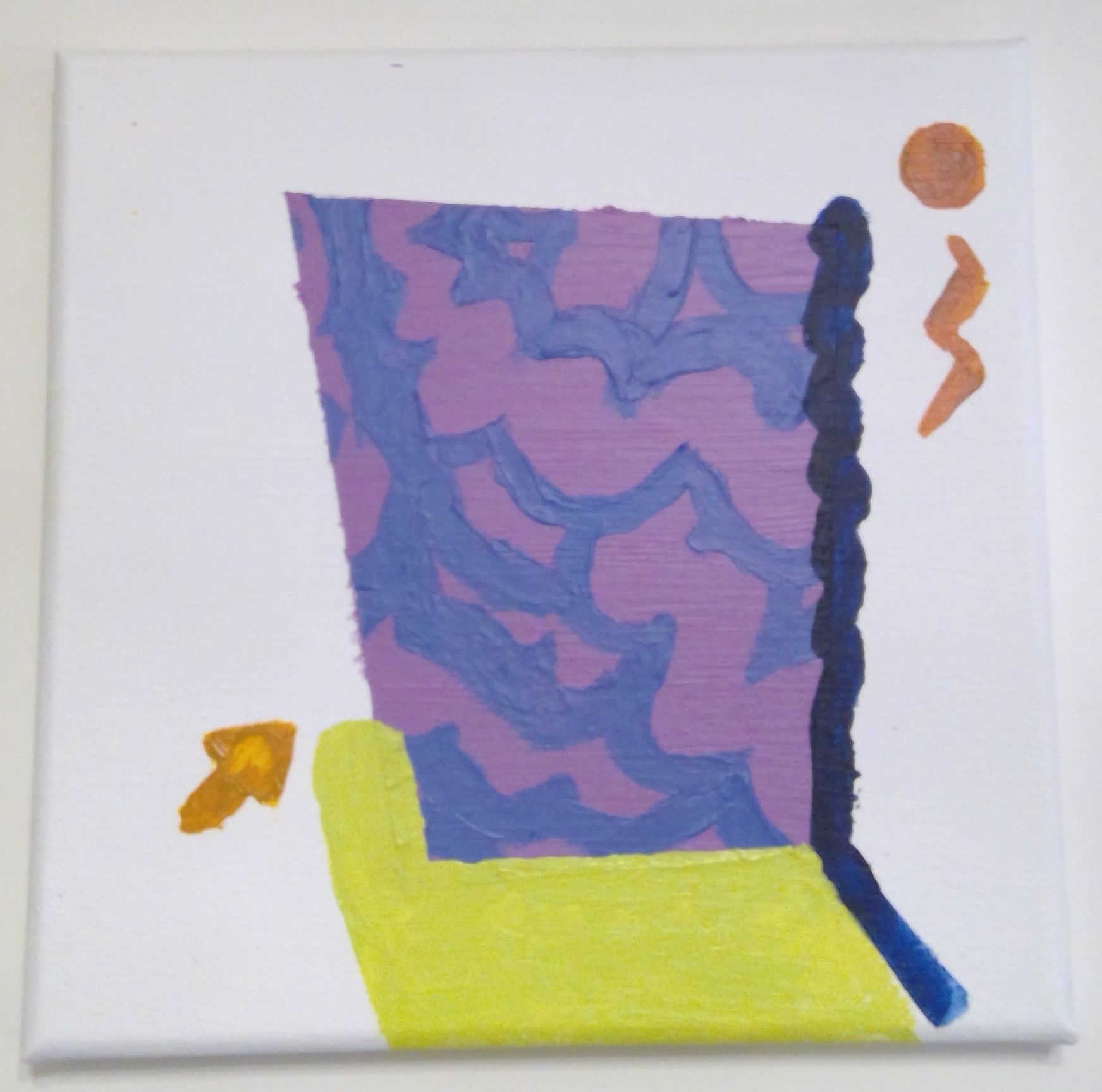
2023: Two acryllic paintings on canvas. Produced for a short online class, this duo has a somewhat different vibe than my usual aesthetic, the landscape especially. It was a nice change of pace to make them!
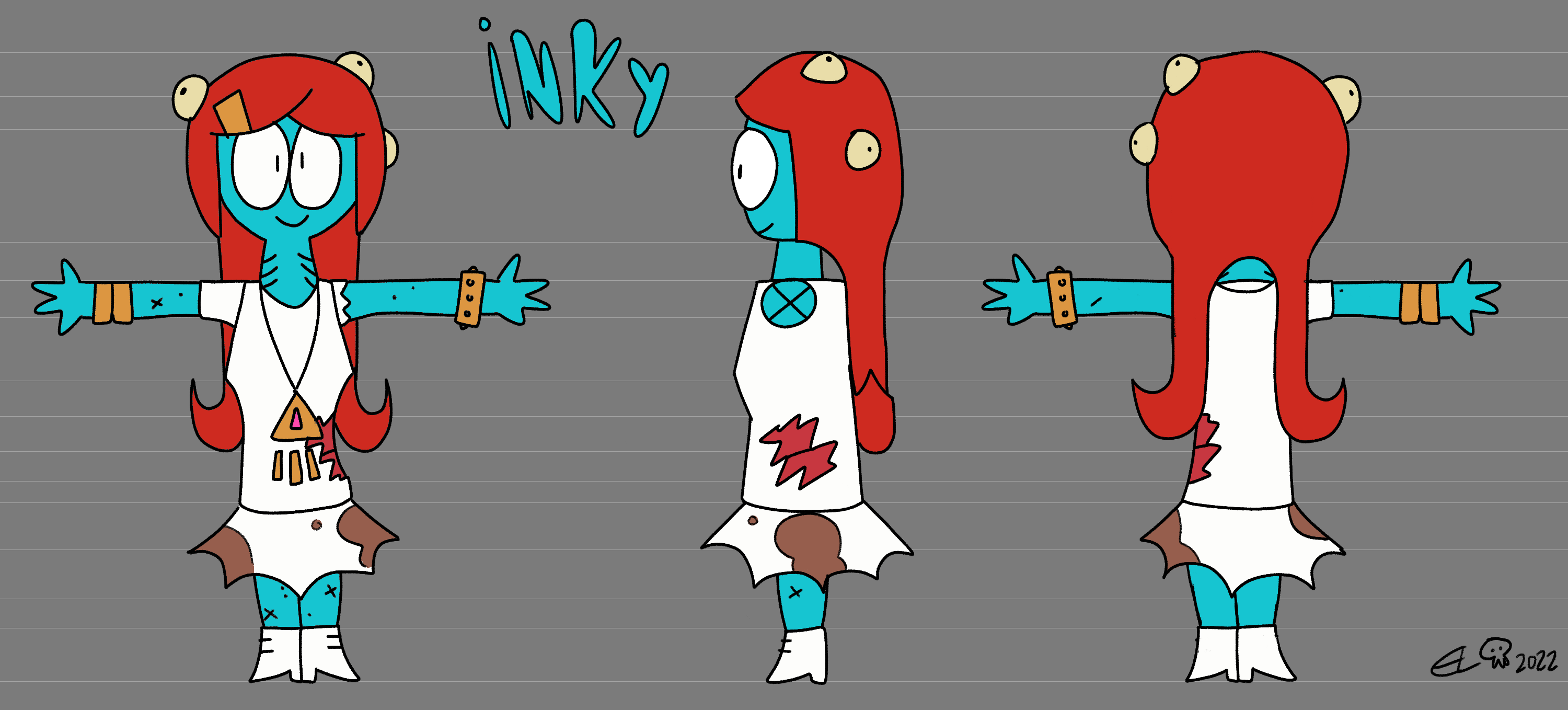
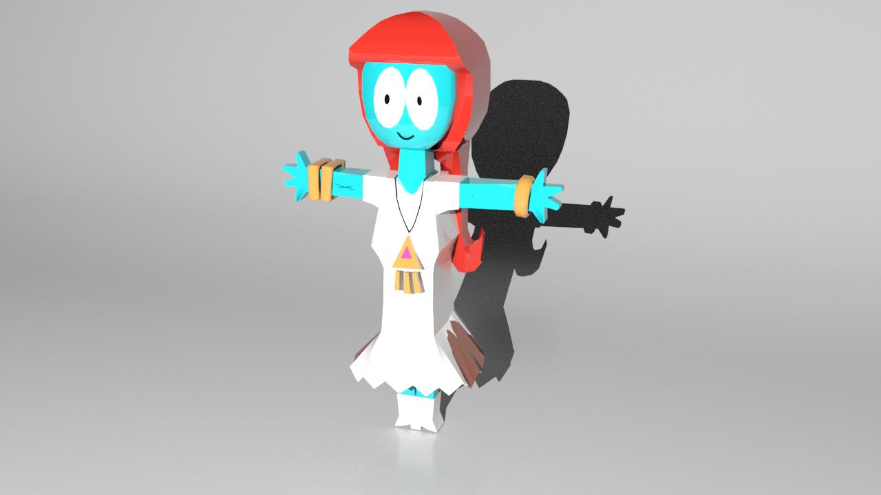
2022: A turnaround design sheet for my character Inky the sorceress, and a 3D model of her using the design sheet as reference. This was an assignment to create a reference for an original character, and in turn model it in Blender. Inky, a mainstay of my cast of characters, felt like a good fit for the project! The 3D model below does miss a few details from her reference admittedly; I might go back to add them sometime.
2022: Digital illustration, package design, and art direction in collaboration with Caybee Calabash 🔗⚠️ for fakenumberland's compilation album "[18] NEW MESSAGES" 🔗⚠️, which I also organized and curated. My idea was to have the cover be a picture of one of the CDr copies of the album that would be sold. Due to schedule conflicts, the CDr's were delayed to after the digital album's release, so we course-corrected: Caybee staged a photograph of a CD holder, with the disc on top featuring a drawing by her of the character Silix (designed by me, named by daytona 🔗⚠️). From there I digitally added elements like geometric shapes and more Silix drawings in Photoshop to complete the art! Later, I made 10 real CDrs of the album for sale, with a unique drawing by me by on each disc. For the cover insert, I designed a back cover featuring the album tracklist and credits.
![Back and front covers of [18] NEW MESSAGES CD Back and front covers of [18] NEW MESSAGES CD](schoolportfolio/18cover back.png)
![Picture of finished [18] NEW MESSAGES CD Picture of finished [18] NEW MESSAGES CD](schoolportfolio/0030555800_10.jpg)
![10 copies of [18] NEW MESSAGES CD, each with a unique design 10 copies of [18] NEW MESSAGES CD, each with a unique design](schoolportfolio/0030555802_10.jpg)
2022: "21st Birthday" gallery exhibition. A three-wall retrospective to commemorate my titular twenty-first! It featured many of my personal and professional works, spanning as far back as 2017 (the year I officially chose on making a living out of my wacky cartoons)! While the show was rather low-key-- I didn't talk about it online while it was up-- it ran for over a week, did pretty well, and I feel very proud and accomplished for it! Pictured below are views of the full exhibition as it was up.
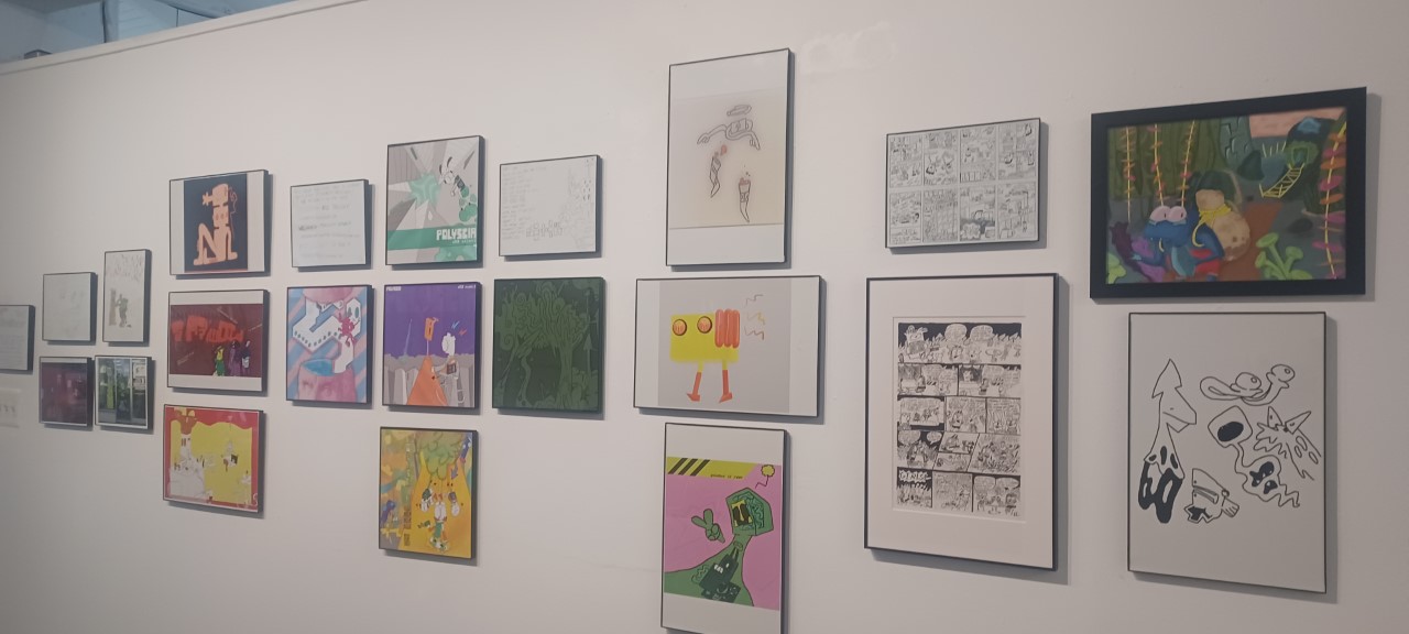
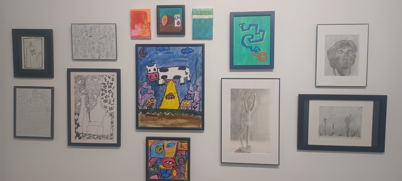
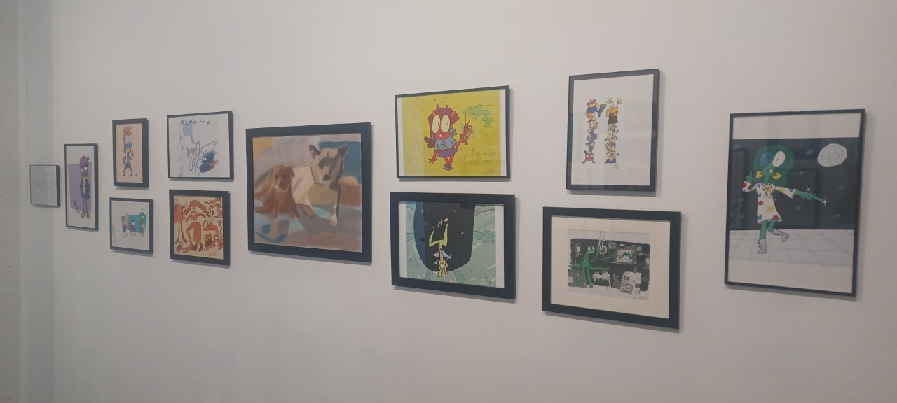
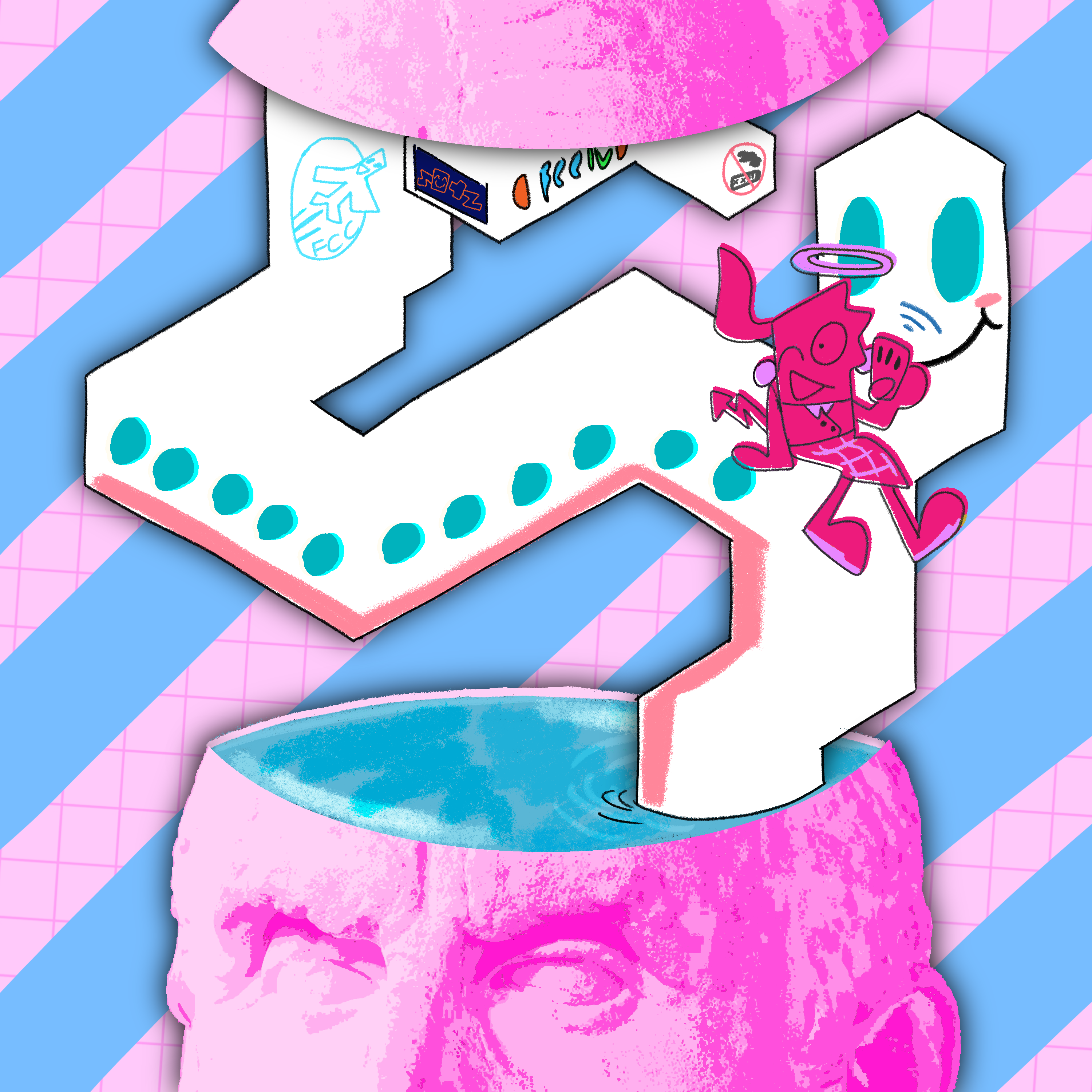
2022: Digital cover illustration and editing for the music compilation "First Class Collection: Volume Four" 🔗⚠️, released by First Class Collective, a vaporwave/experimental music label. They wanted me to include a Roman Bust in some fashion, and I sought to tie into the plane travel theming of its branding as well. This is the result of that thought process; the structure coming out of Chrysippus's popped-open head is supposed to be an abstracted airplane! The flight attendant character would appear again on the cover of Mile-High Club Vol. I 🔗⚠️, which I collaborated with EFFYISOFFLINE 🔗 on.
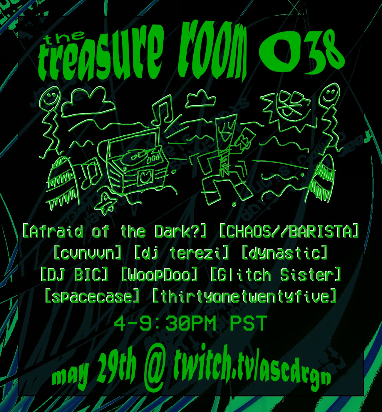
2022: Digital illustration and poster design for Episode 038 of The Treasure Room 🔗⚠️, a series of online music events organized and hosted by ASCDRGN 🔗⚠️, with whom I collaborated with for this flyer. I decided on a summer kickoff theme to fit the late-May date. Using Adobe Illustrator, I made eyecatching warped text for titles and headers, a cartoon drawing, and a mockup for the poster overall. ASCDRGN created the background, put together the final composition, and the end result came out basically perfect! Teams make dreams ^_^. (I'm not sure if I meant to make the dancing fella resemble a Darwinian, but it likely was knowing me. Hi Introversion 🔗⚠️!)
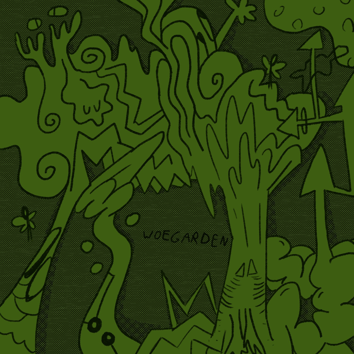
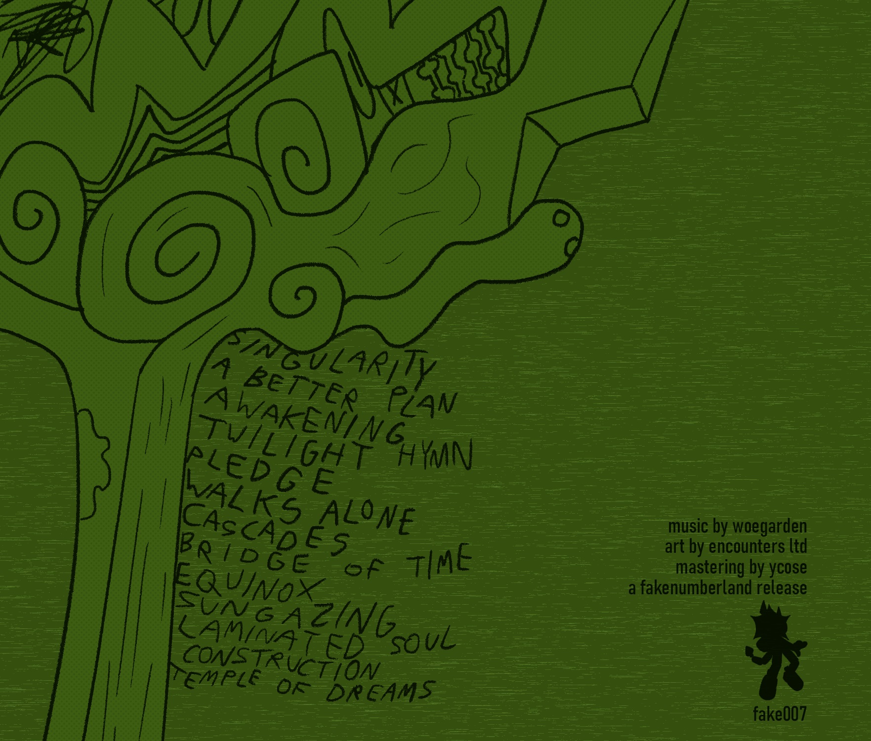
2022: Digital cover illustrations for the music album "twilight hymns" 🔗⚠️ by woegarden 🔗. When giving the album an initial run-through, I noticed it felt nicely outdoorsy, especially considering it's a synth album. In describing the album for my label fakenumberland, where it was released, I likened it to a hike in the forest. Leaning into that theme more was the cover I made, which is meant to resemble a bunch of trees. Most of the details came through improvisation and experimentation, seeing what I felt worked best in each spot.
2020, 2022: Mock Famicom game cartridge labels for My Famicase Exhibition 🔗⚠️, an annual gallery show at Japan's METEOR gallery and shop 🔗⚠️. The exhibition's concept combines visual design, storytelling, and the imagination of the audience-- the artists make the sticker art for a nonexistent game cartridge as well as a small blurb about it. The gallery staff puts the art on real game cart shells and are presented at METEOR and online, for the audience to wonder about what the hypothetical games they hold could be like...
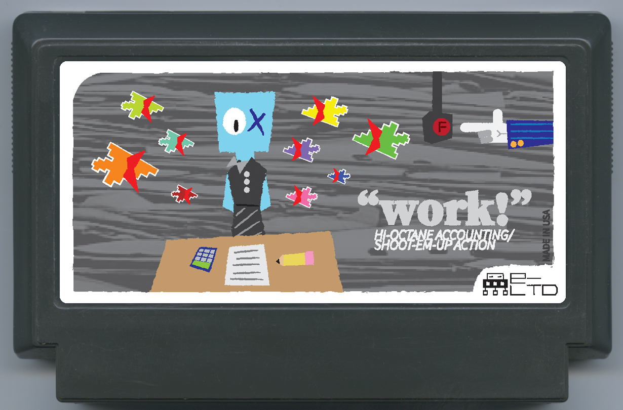
2020 - "work!" - "SONATINA has problems! Her boss will fire her if she doesn't get those papers done by 8! Meanwhile, her archenemies, the CURSOROIDS, plot her demise! Can you help Sonatina get her "work!" done and avoid a cursory fate?"
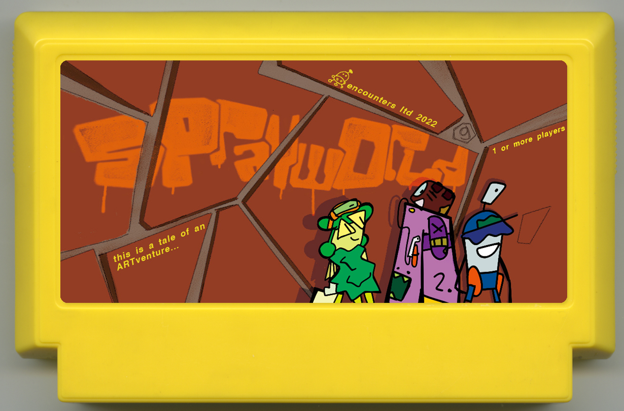
2022 - SPRAY WORLDⓖ: an ARTventure tale - "Every 2 years, the Aero Express contest is held in secret for young street artists. Draw murals in ART mode, then watch how your creations affect the story. Includes 8 playable artists with their own quirks and artistic philosophy. Make magic on your own or with friends!"
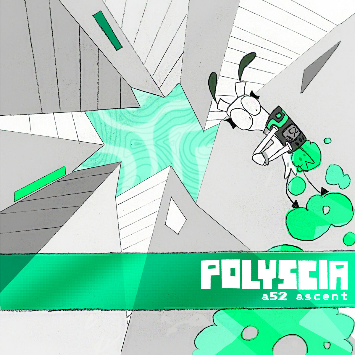
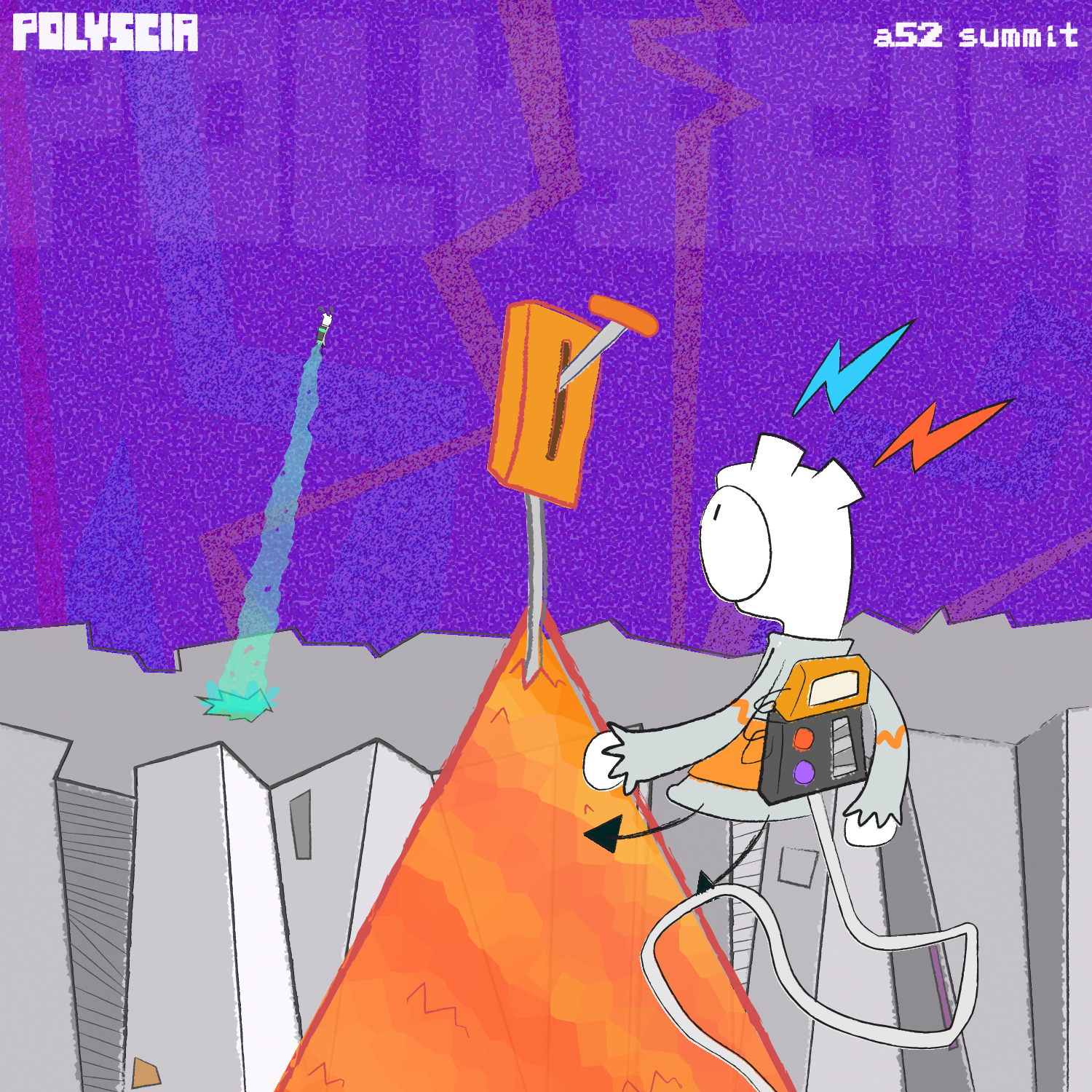
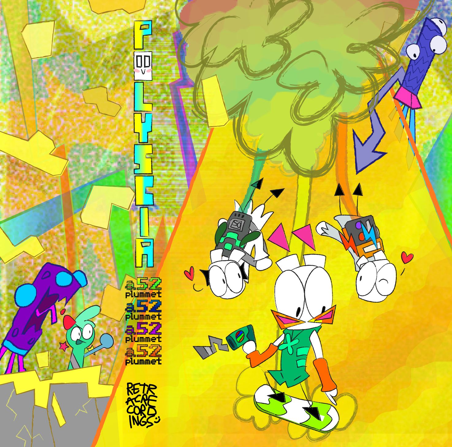
2021: Cover illustrations for the A52 series of music albums by Polyscia (aka Caybee Calabash 🔗⚠️!): "A52 ASCENT " 🔗⚠️, "A52 SUMMIT" 🔗⚠️, and "A52 PLUMMET" 🔗⚠️. ASCENT is a scanned pencil drawing that I digitally colored using Photoshop; the other two were made in Adobe Illustrator. Audie Ellis 🔗⚠️ contributed some texture work on PLUMMET, which I used as part of the background.
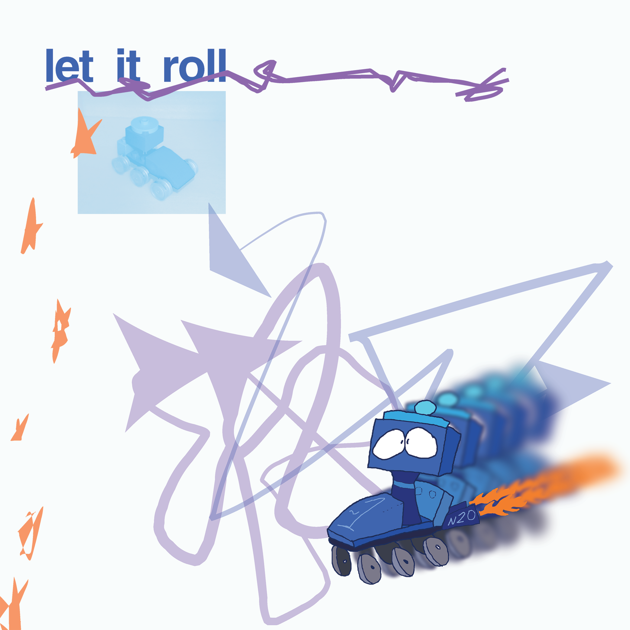
2021: "Let it roll", a digital illustration and design with photography. The photograph in the background features a LEGO sculpture designed and build by me, and I drew a character inspired by it in MS Paint. I placed these in an Adobe Illustrator canvas and added effects and additional design elements.
2021: PAC-MAN character redesign concepts. PAC-MAN belongs to Bandai Namco; these are unnoficial designs made for fun. I sure would love to actually work on this property, though! For my version of the characters I took inspiration from various Pac-media, such as the original game's American cabinet art and the Hanna-Barbera cartoon. From left to right: Otto "Pac-Man", Pepper "Ms. Pac-Man", Elroy "Blinky", Pinky, Inky, Clyde, and Sue.

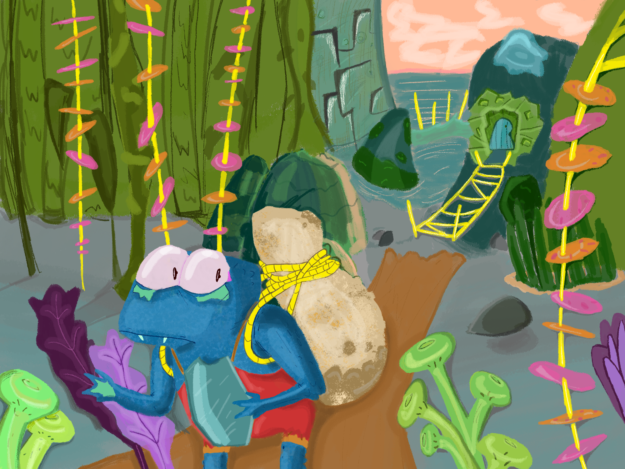
2021: "Frog in a Froggy World" digital painting. I drew this in Photoshop from the ground up for a college final; world and character concepts, rough sketch, clean sketch, and painting it all in! It was a rather ardurous process, but the end result is something I'm super proud of! I'd say my favorite details are the ropes fashioned out of the reeds of the tall pink and orange plants, and the subtle textural mottling on the amphibious character's skin.
2021: "Abby at the Dump" digital illustration. An MS Paint drawing, and one of my favorite pieces I've made! I'm really proud of the background being done in 1-pixel-wide outlines.
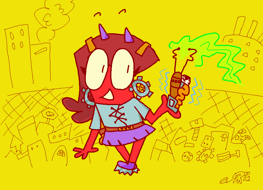
“Ooh la la! I have no idea whatever this wacky thingy does, but it’s probably incredibly dangerous! Awesome!” -Abby (Steampunk Ver.), pictured
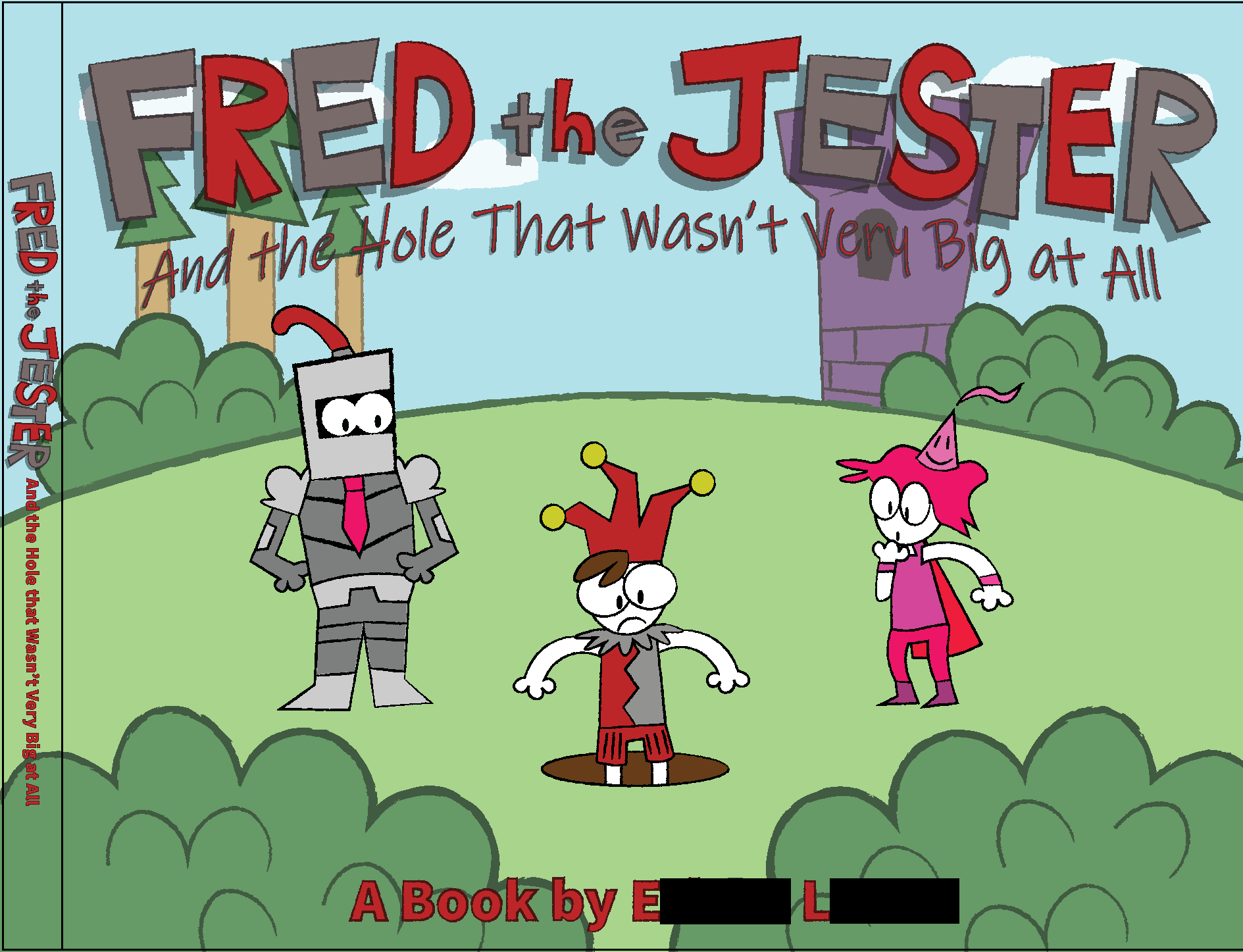
2019: "Fred the Jester and the Hole That Wasn't Very Big At All" children's storybook cover concept. This was done totally in Adobe Illustrator, though I may have done sketches too. Inspired by some of my favorite storybooks, I devise these characters and a silly premise to base this concept around. For what reason would someone leave such a small hole in the ground!?
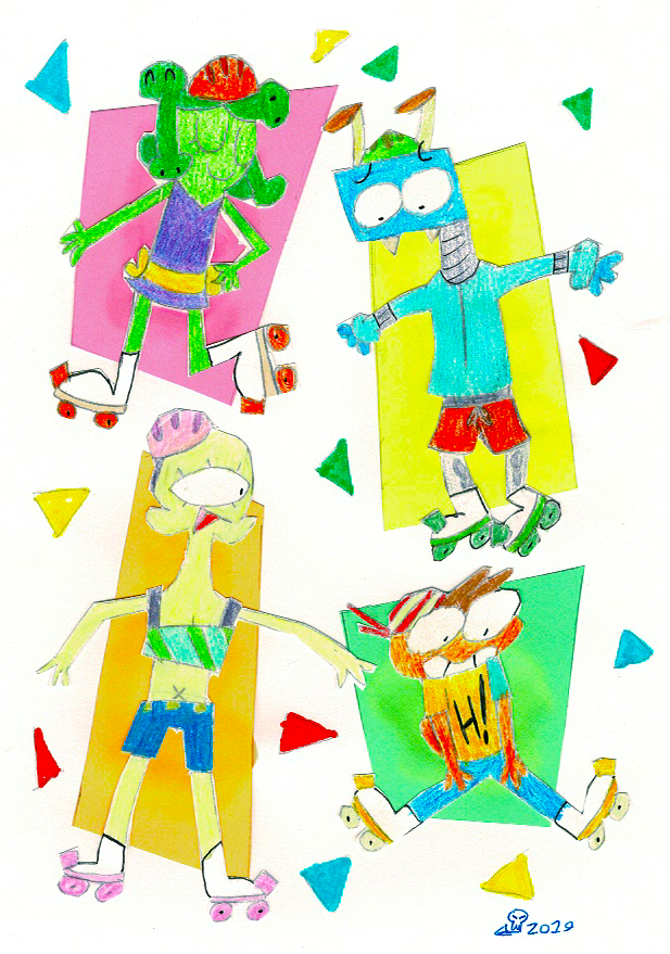
2019: "Rollerbladers" traditional illustration/mixed-media collage.
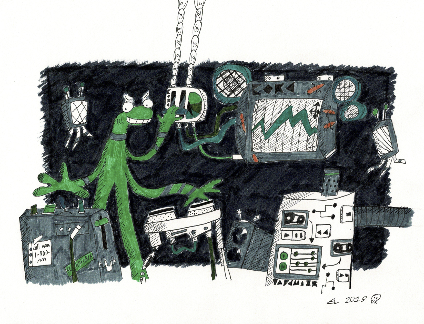
2019: "Disc Jockey" traditional illustration.
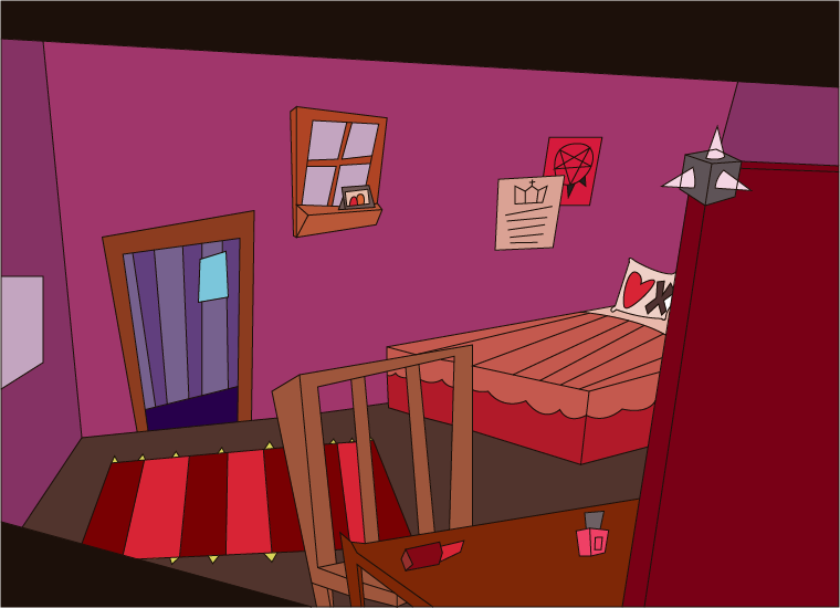
2019: "Abby's Room" digital illustration of background concept.
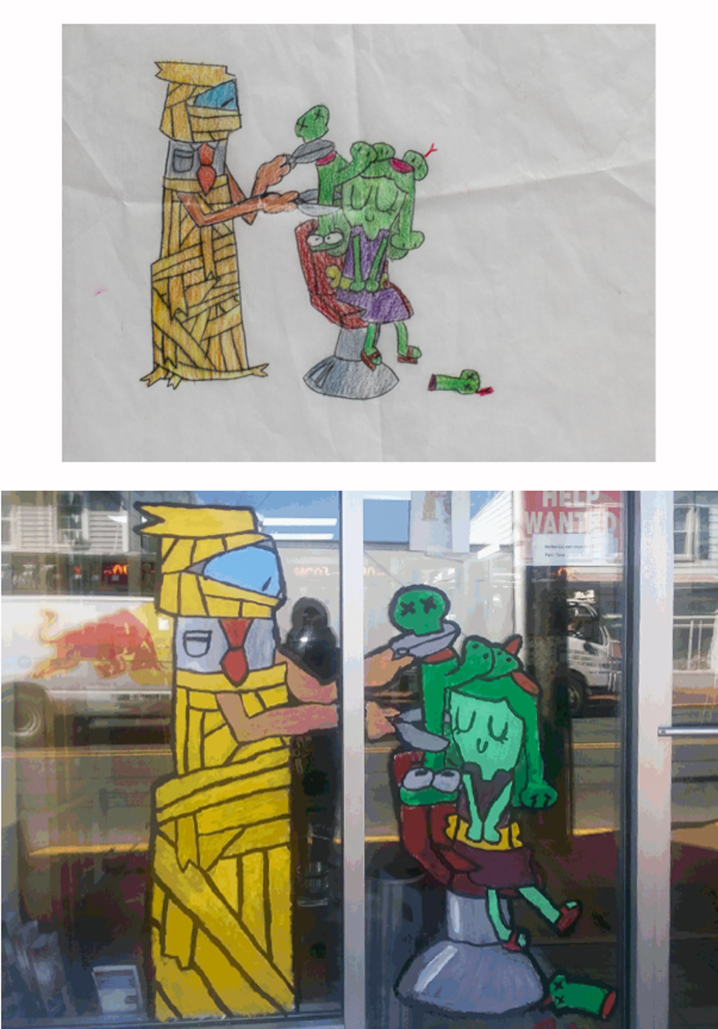
2018: "Melissa Gets Her Snakes Done", a Halloween themed window painting for a hair salon. At the top is a color concept sketch, which I used as a reference for the finished painting below it. In my earlier sketches of this scene Melissa actually had a neutral expression, rather than the little grin I decided fit better. Being a seasonal storefront painting from my High School days, it's long gone by now, but it was fun!
FAIR WARNING: This drawing is a smidgen grotesque and has a bit of blood. Thankfully though, the snakes get better after this.
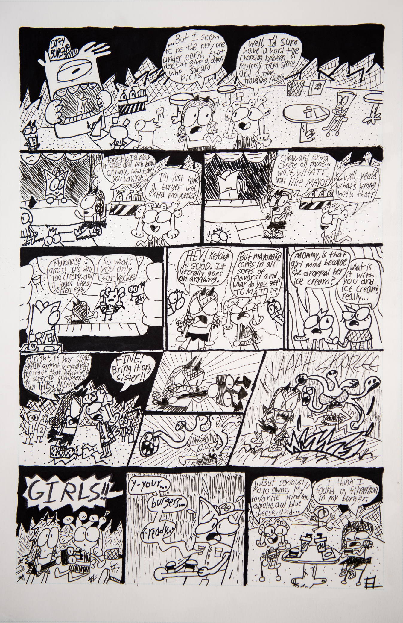
2018: "Mayo vs. Ketchup" traditional comic page.
